PropStream
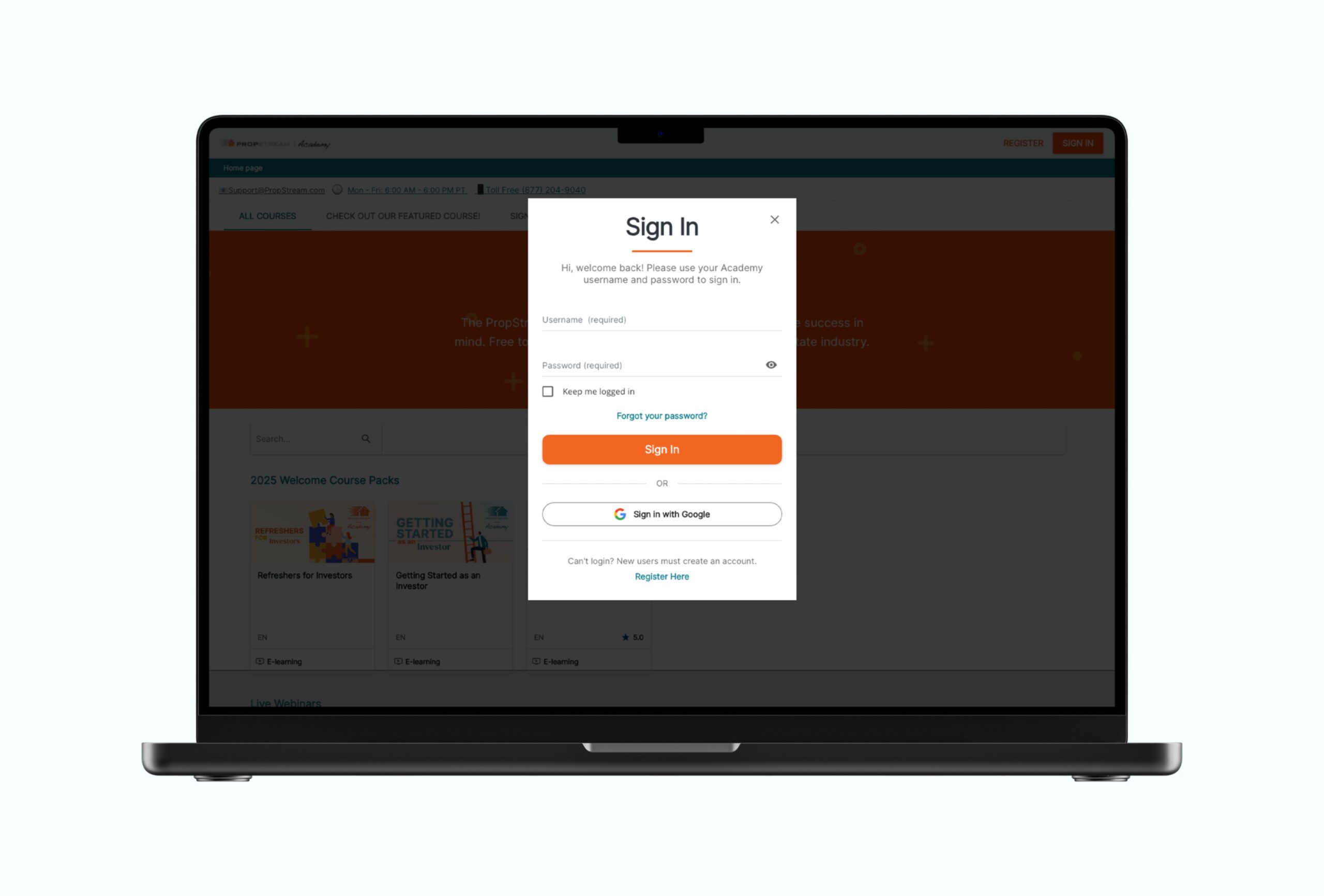
Streamlined signin page to improve platform user experience

Project Overview
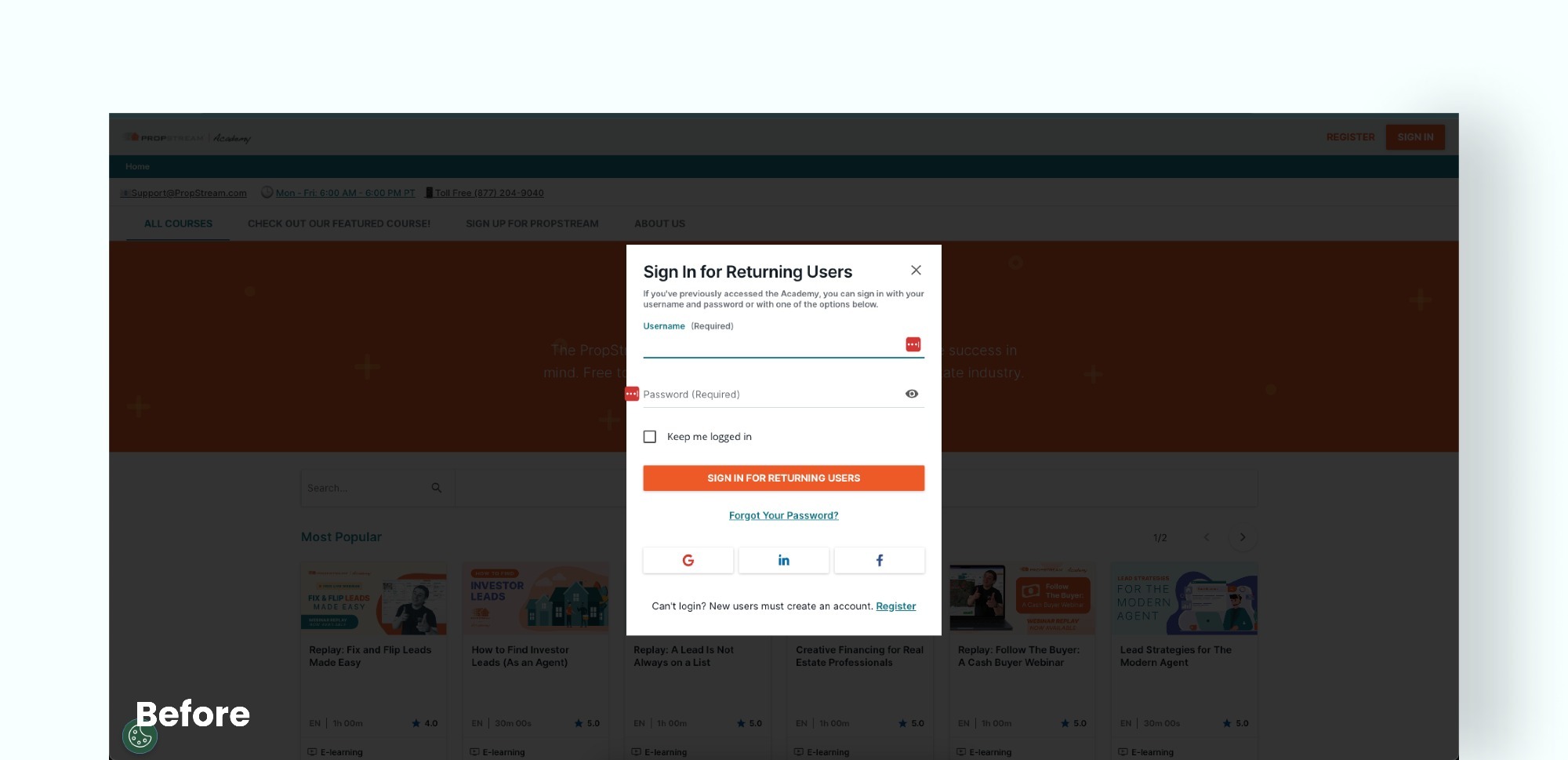
PropStream uses Docebo as their LMS to provide a seamless learning experience; however, the default sign-in page was a notable exception. During discovery calls with the client, the primary issues identified included excessive text, cramped spacing, an overabundance of sign-in options, and poorly visible actions such as “Forgot Password” and “Register.”
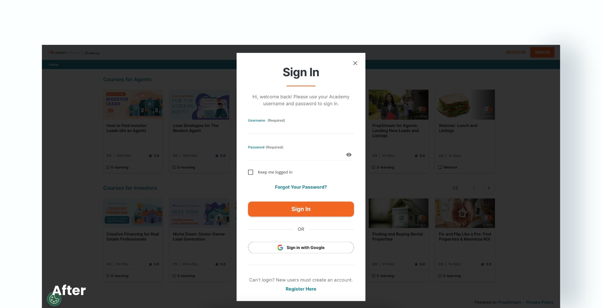
Using only Cascading Style Sheets (CSS), we addressed these pain points while integrating PropStream’s branding. Key updates included simplifying the “Sign in for returning users” header to “Sign In” via the localization tool, making the sign-in instructions more concise, reorganizing the “Forgot Password” link to appear above the sign-in button, adding a styled “or” border break with the Google button, and improving element spacing for better usability.

