Clarion Events - ISO Dashboard
Frontend design for ISO Dashboard application

Project Overview
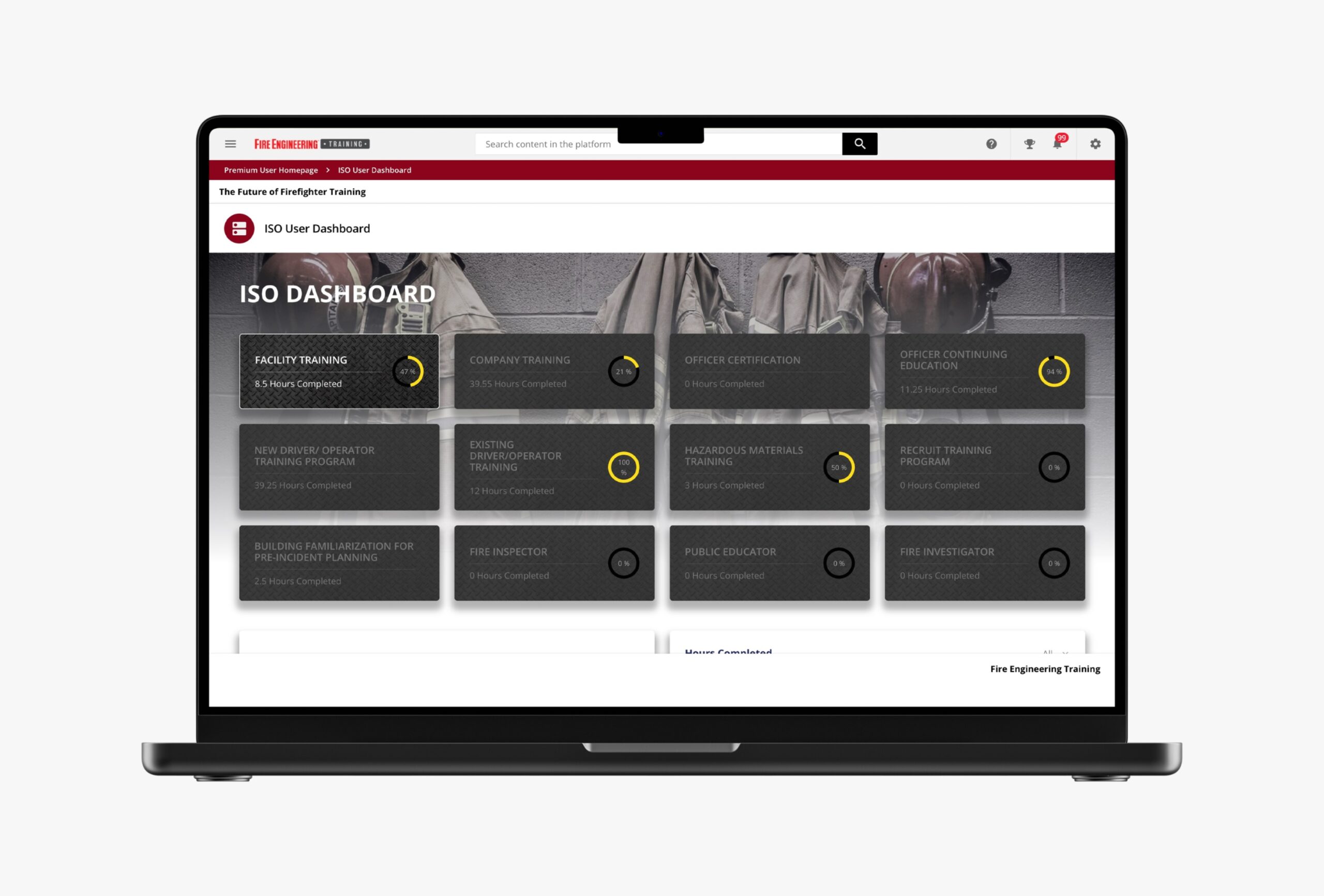
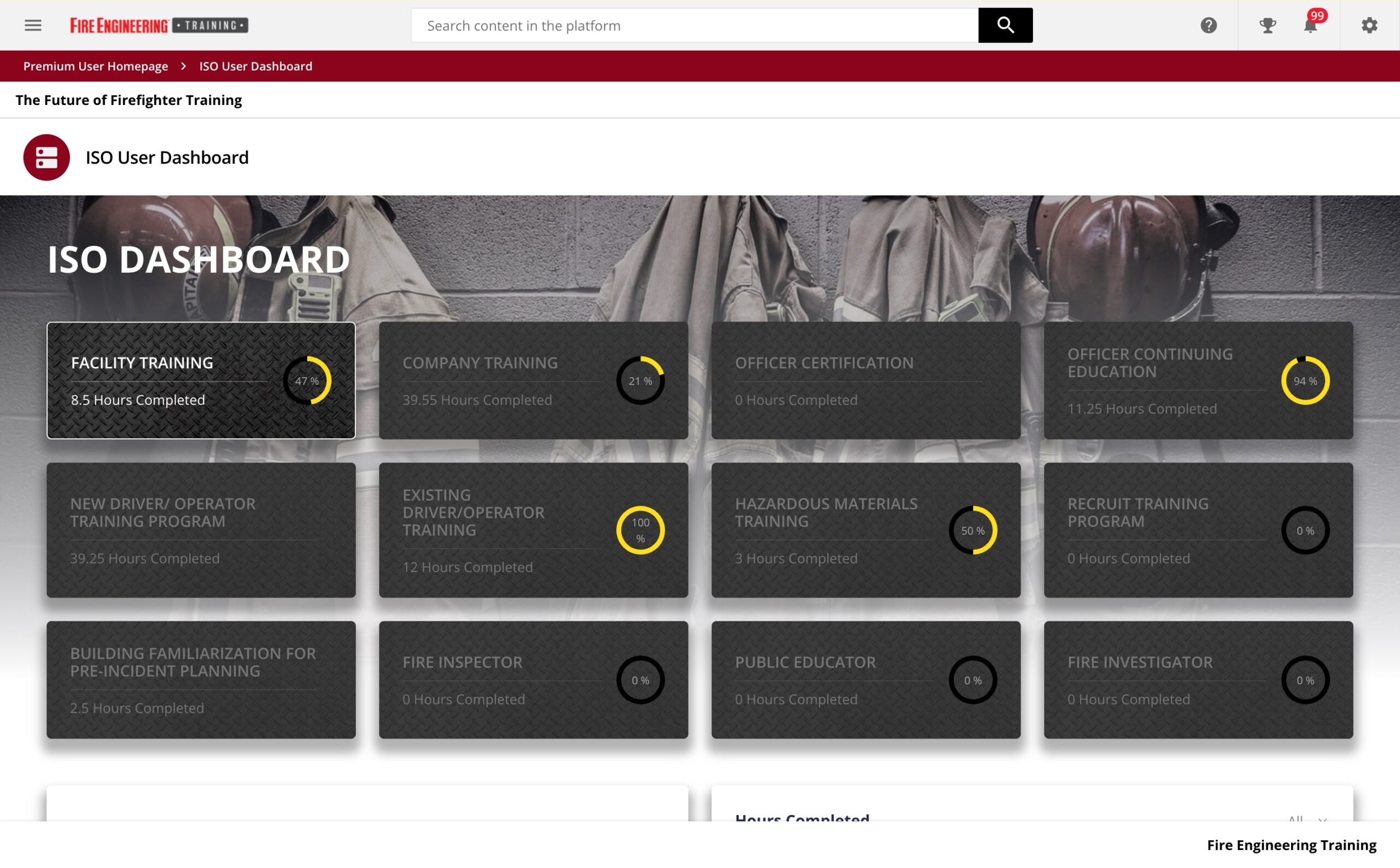
In collaboration with the technical team, a custom user interface was developed and applied to the ISO Dashboard application for Clarion Events. The dashboard tracks the number of hours completed across 12 distinct buckets, each represented as a tile displaying the bucket’s name and completed hours. For buckets with a target number of hours, a progress ring visually indicates completion as a percentage.
The design incorporates thoughtful details, such as using a metal grate pattern reminiscent of fire truck equipment as the background for the tiles and a firehouse yellow color for the progress rings, reflecting the application’s use by firefighters.
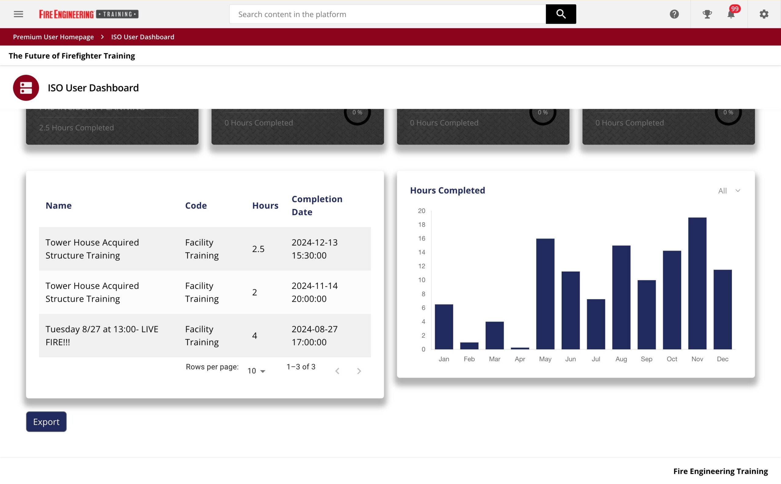
At the bottom of the application, a data table displays the hour entries for the selected bucket, while a bar graph provides a visual summary of the hours completed each month over the past 12 months. This combination of visual and tabular elements ensures an intuitive and efficient user experience.

